



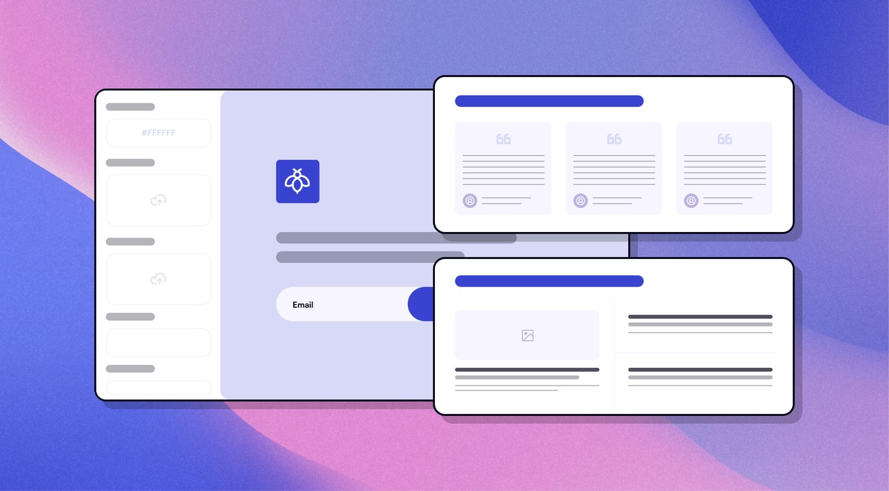
What is a landing page
A landing page is essentially a single-page website aimed at turning an ordinary visitor into your customer. A well-structured landing page is narrowly focused on a specific product and builds a consistent user journey, culminating in them using your service or purchasing a product.
According to a recent Unbounce study, the median conversion rate for landing pages is 6.6%, based on 41,000 landing pages and 464 million visits. However, a landing page itself does not guarantee results, as much depends on the offer itself, as well as its structure and content.

When a landing page becomes effective
It is important to understand that a landing page is not just a collection of beautiful advertising slogans. It is a combination of specific elements that create an effective landing page for a business. Namely:
Specific offer – one landing page = one offer. You should not try to advertise all aspects of the business.
Understanding the target audience – the tone, structure, and visual style of the landing page stem from an understanding of the target audience.
Structural consistency – each subsequent block of the page supports the thesis of the previous one, without unnecessary distractions.
Landing page structure: an offer understood from the first block
For a landing page to work, you should adhere to a typical basic structural logic:
First screen – headline, image or video (if needed), and essentially a “Call to Action” (CTA) button. The user must understand the offer as quickly as possible. Do not dump the entire brand story here.
Identifying the problem – drawing attention to the problem the target audience is trying to solve.
Solving the problem – and immediately followed by the proposed solution.
Product advantage – arguments as to why your product solves pressing problems.
Evidence base for advantages – this includes reviews from other buyers, examples of successful product use, or solution implementation.
Proof of expertise – certificates, awards, case studies, portfolios, etc.
Another “Call to Action” – another button prompting action after the arguments presented above.
Footer – the final part of the page with contact details, links, and other important information.
Understandably, not every landing page must strictly adhere to such an advertising strategy, but it is important that each subsequent block answers the questions of the previous one. Much depends on the product itself and the defined advertising strategy. We at Geniustudio will gladly help you design, structure, and create a landing page!
Landing page design as an additional argument
Structuring information is not everything. Do not forget about the visual aspect. High-quality UI/UX design will help increase conversion and click-through rates. There are also certain rules here:
Visual hierarchy – a contrasting, prominent CTA button that clearly indicates it is a clickable element. It is also necessary to have enough visual space around the button to guide the user's eye. The main task is to guide the user's eye from the headline to the CTA.
Readability – paragraphs, headings, and other textual information should be easy to read. Thus, we create white space that separates semantic blocks. Visually pleasing fonts and concise text ensure that a potential client will read the information to the end.
Mobile adaptation – depending on the smartphone model and screen, text, buttons, and other visual elements must remain "in place." Buttons should not shift or require additional zooming.
A well-designed landing page is not just a nice decoration, but a tool that holds the user's attention and guides them to click the CTA button. You can see how these principles work in practice on the example of one of Geniustudio's landing pages.
And most importantly – the CTA itself
The presence of a CTA and its visual "readability" do not guarantee the desired user click. It is not enough to insert it once and hope for a result, but neither should you overload the landing page by obsessively placing it in random places.
A recommended, though by no means ultimate, placement principle:
Main button next to the offer – the primary button immediately after presenting the product.
Repetition in natural places – after the description, reviews, pricing, and evidence base. It is also worth repeating the CTA button in the final block, putting a conditional "period" in the journey from visitor to customer.
Specific call – phrases like "Send," "Get," or "Find out" are too vague for a specific action. Instead, it is better to clarify: "Submit an application," "Get a consultation," or "Find out the price." Provide specifics.
Mobile adaptation – discussed in the previous block, but it is something worth emphasizing. When adapting a button for a smartphone, make sure it is large enough and comfortable to tap.
Ultimately, the CTA becomes not just an annoying button, but a compelling argument with each subsequent block of the landing page, making the user want to click it more and more.
Technical setup
From the moment a client sees an ad and clicks through to the landing page, you must ensure the page opens quickly and immediately adapts to different screen formats. Even a perfect landing page will not work if the client does not wait for the page to load or display adequately on their screen. You should also keep in mind the functionality of links and CTA buttons, which must lead to correctly working pages and forms.
After the launch, errors and glitches are also possible and require monitoring. Here, your landing page will need constant technical website support. Contact Geniustudio, and we will provide this support.

Post-launch analysis
After publishing a landing page, the work on it does not end. It is necessary to analyze the performance of the landing page and, if necessary, make the required adjustments. Here we check the conversion rate, that is, how many visitors went through the landing page journey and became your customer. We check how many users ultimately clicked the CTA button or how many users visited the page but left without taking any further action. This also includes scroll depth – how far the client scrolled down the page. And finally – analyzing applications or purchases followed by A/B testing of new element versions, including headlines, CTAs, forms, problem descriptions, and arguments.
Conclusion
Summing up, a successful landing page is a combination of structure, UI/UX, and a well-formed "Call to Action," which ultimately successfully guide the user through the page. If you want to make sure your landing page has taken all the necessary steps to success, it's time to order a landing page from Geniustudio!

